What a React component library does for your users
Your German visitor opens the menu and the last item wraps onto two lines. Your Arabic visitor gets a drawer that slides in from the left when everything else on the page reads from the right. Each of these is a small thing, and each one is where a visitor decides whether your site was built for them.
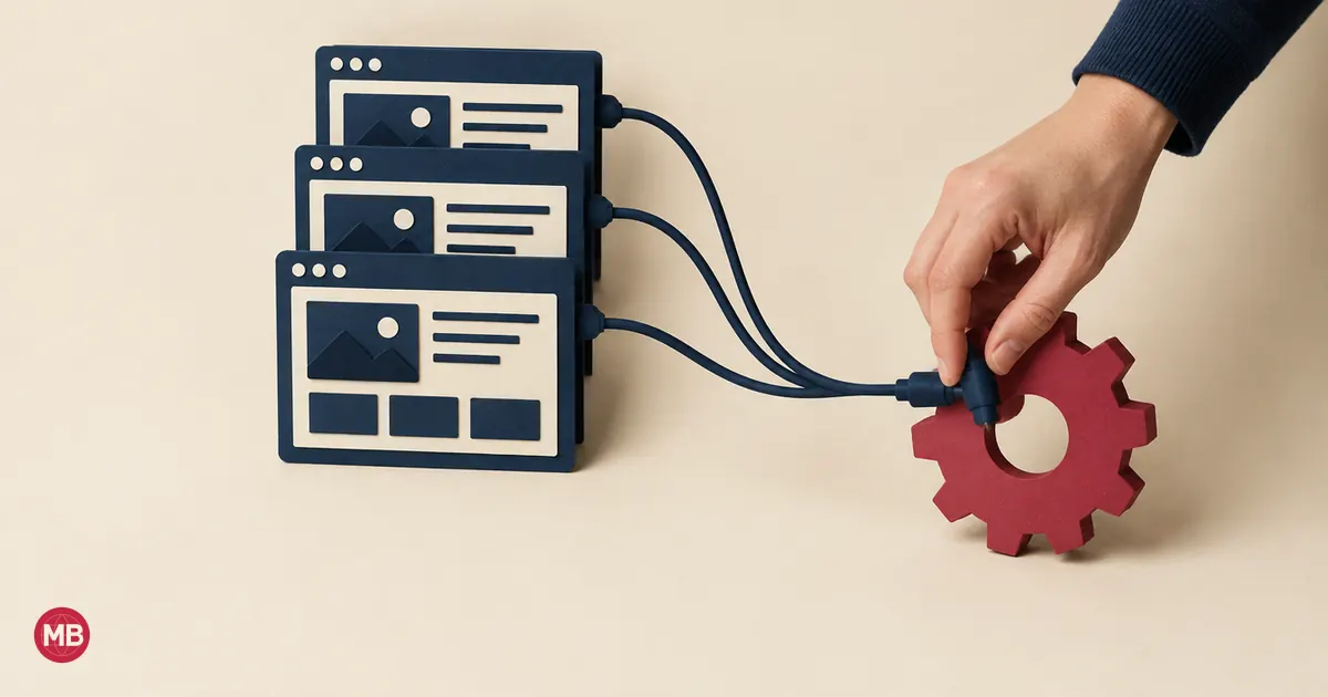
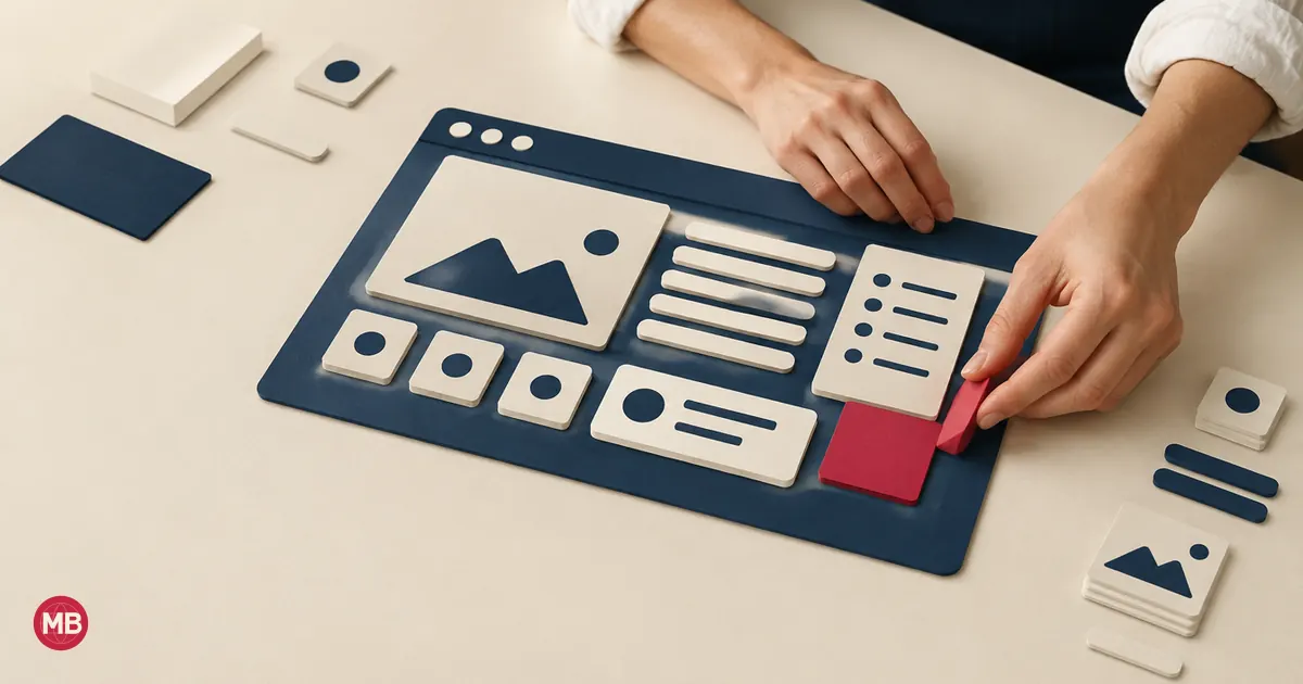
A React component library gives your team those menus, dialogs, forms and alerts ready-made, with the keyboard behaviour and screen reader support already worked out. Your developers spend their time on your product, and every language version of your site inherits the same quality of interface.
Below are the twelve tools our team added to its working directory in November 2026, grouped by the job each one does, with what to check before a library goes onto a site that sells in several languages.
The 12 tools at a glance
| Tool | What it gives you | Best for |
|---|---|---|
| Radix UI | Accessible behaviour, styling left to you | A design system of your own |
| shadcn/ui | Styled components you copy and own | Most business sites and apps |
| Sonner | Notifications in one line | Confirmations after a form or an order |
| react-hot-toast | Lightweight notifications | Projects that want a small, proven option |
| Vaul | A drawer that slides up on phones | Filters, carts and menus on mobile |
| cmdk | A search-everything command menu | Sites and apps with many pages |
| NumberFlow | Numbers that animate as they change | Prices, counters and dashboards |
| Magic UI | Animated sections for landing pages | Campaign and product pages |
| Aceternity UI | Animated components and templates | Hero sections and scroll effects |
| Tailgrids | Components with a matching Figma file | Teams where design and code work together |
| 21st.dev | A marketplace of community components | Finding one specific piece fast |
| Beautiful UI | Components for AI chat interfaces | Sites adding an assistant |
Every tool in the table is built for React, the technology behind Next.js sites, this one included.
Foundations: Radix UI and shadcn/ui
The foundation decides how your interface behaves for someone using a keyboard, a screen reader or a right-to-left language. Choose it first, because everything else in the list sits on top of it.
Radix UI
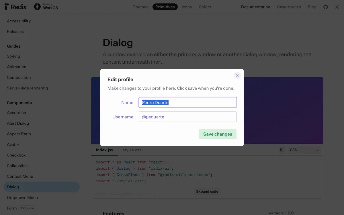
Radix UI describes its Primitives as unstyled, accessible, open source React components for web apps and design systems. You get the behaviour of a dialog, a dropdown, a set of tabs or a tooltip, and your designers decide how each one looks.
For a multilingual site, the part that matters most is its Direction Provider, which sets the reading direction for the whole app. Set it once and menus, sliders and tabs follow the direction of the language on the page.
shadcn/ui
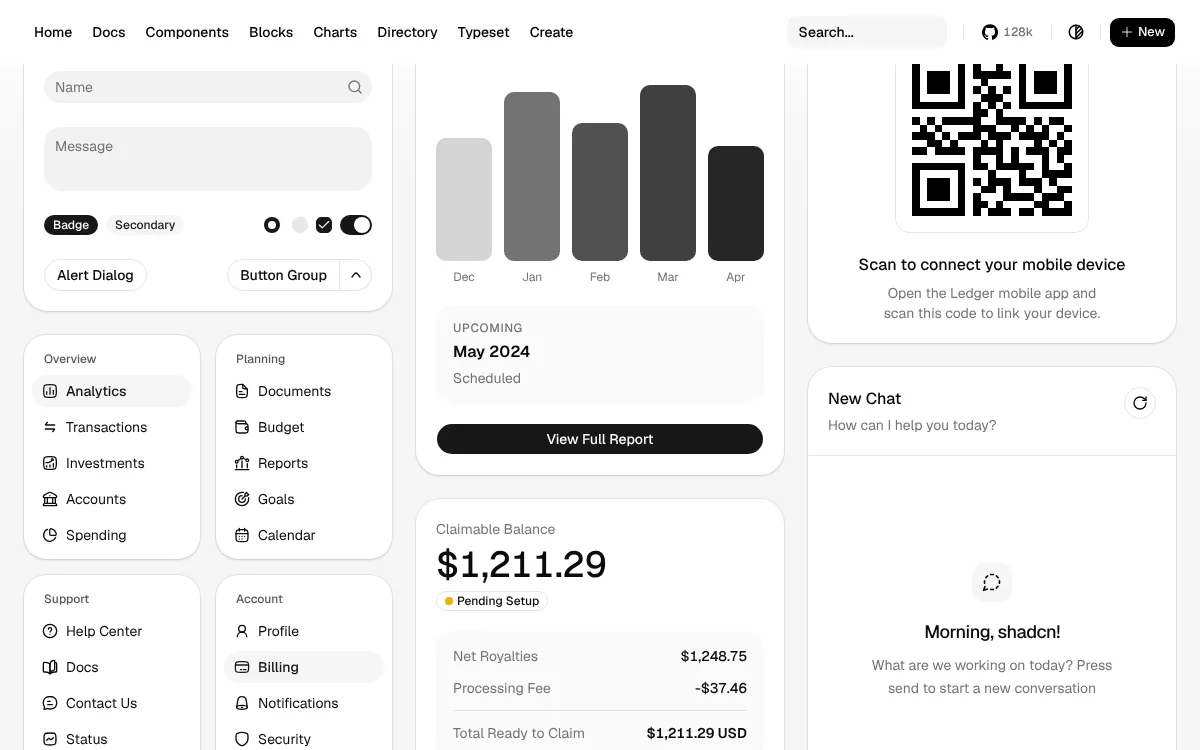
shadcn/ui builds on Radix and adds the styling. Its distinctive idea is ownership: you copy each component into your own project and edit it there, so your team controls every label, spacing value and breakpoint. When a German button needs more room, the fix is a change in your own code.
It covers forms, data tables, dialogs, a sidebar, a calendar and a command menu, which is most of what a business site or a customer portal needs.
Under the styling sits the layer model below.
Feedback and navigation: Sonner, react-hot-toast, Vaul and cmdk
A visitor who has just sent a form or paid for an order wants one thing: confirmation that it worked. These four tools handle the moments where your site answers the visitor.
Sonner
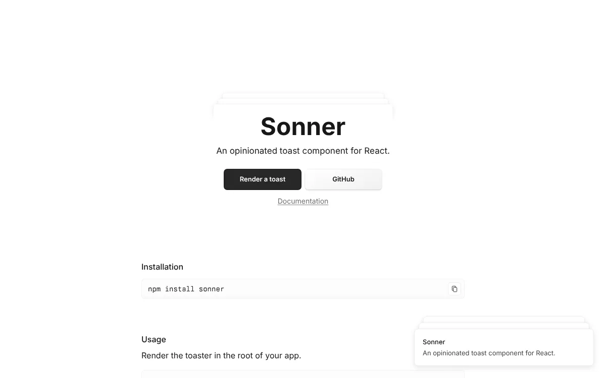
Sonner is a notification component for React, and the one shadcn/ui uses for its own notifications. It shows a short message in the corner of the screen, such as "Message sent" or "Added to basket".
react-hot-toast
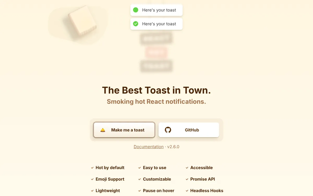
react-hot-toast is the long-standing lightweight choice for the same job. Each notification appears, stays long enough to read and fades away by itself.
Pick one of the two and use it everywhere. A notification is also a string to translate, so check how each message reads at German length before launch.
Vaul
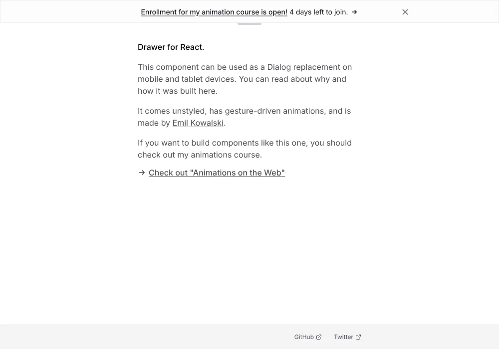
Vaul is a drawer component for React: a panel that slides up from the bottom of a phone screen and closes with a downward swipe. It suits filters, baskets and mobile menus, where a thumb reaches the bottom of the screen most easily. It is also the drawer behind the one in shadcn/ui.
cmdk
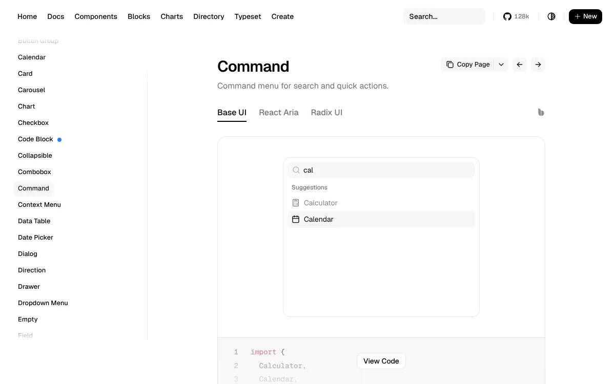
cmdk is the command menu that opens when you press Cmd and K: a search box that reaches every page and action. On a site with many pages per language, it gives returning visitors and your own team a direct route to what they want.
Motion and polish: NumberFlow, Magic UI and Aceternity UI
Motion earns its place when it helps a visitor follow a change on the page. Used once or twice per page, it makes a price update or a product section feel finished.
NumberFlow
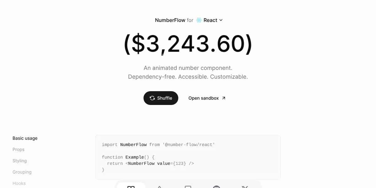
NumberFlow animates a number as its value changes, with the digits rolling into place. It formats currency, percentages and compact figures, which makes it a good fit for price switchers and dashboards. Ask your developers to pass it the visitor's locale, so a price reads 1.299,00 € in Germany and €1,299.00 in Ireland.
Magic UI
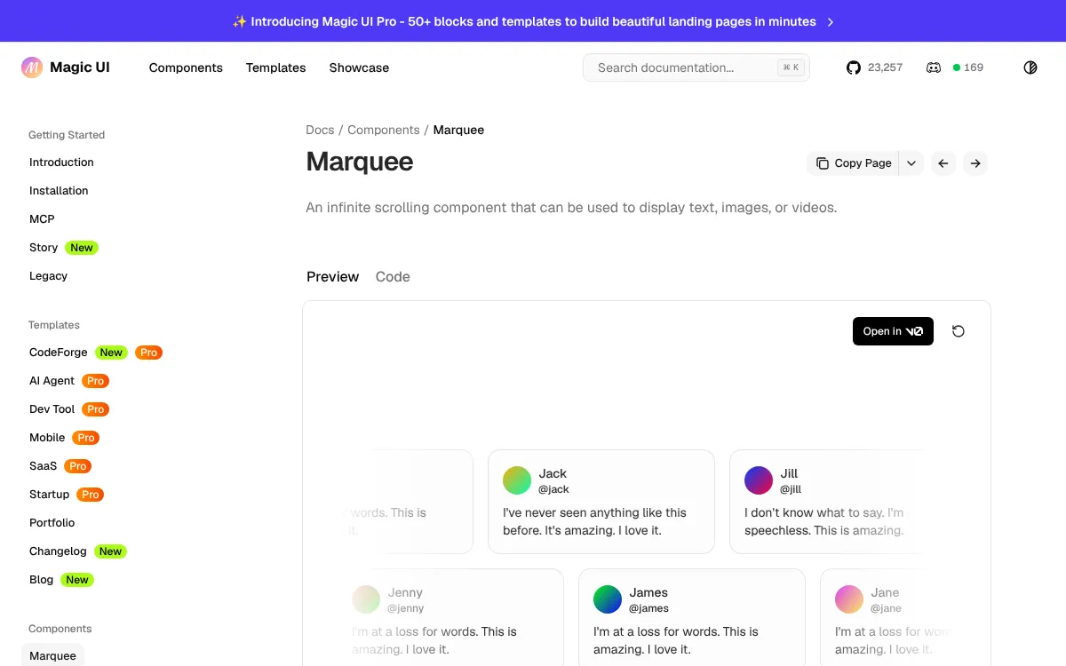
Magic UI offers animated components and templates for landing pages, such as a marquee that scrolls a row of customer quotes. It installs the same way as shadcn/ui, so the code ends up in your project where your team can adjust it.
Aceternity UI
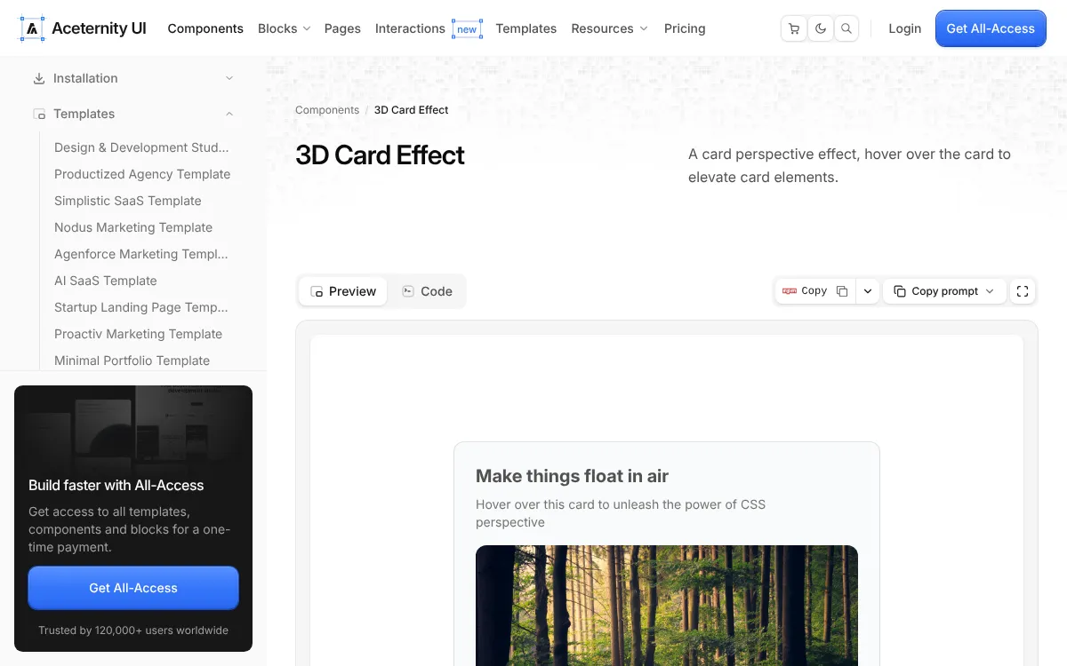
Aceternity UI presents itself as a React library of more than 200 copy-and-paste components, blocks and landing page templates. Like Magic UI, it puts the code in your own project.
Test each animated section with your longest translated headline. A hero built around a five-word English title needs room for nine words in French.
Kits and marketplaces: Tailgrids, 21st.dev and Beautiful UI
Kits and marketplaces save time when you need a whole section or one unusual piece.
Tailgrids
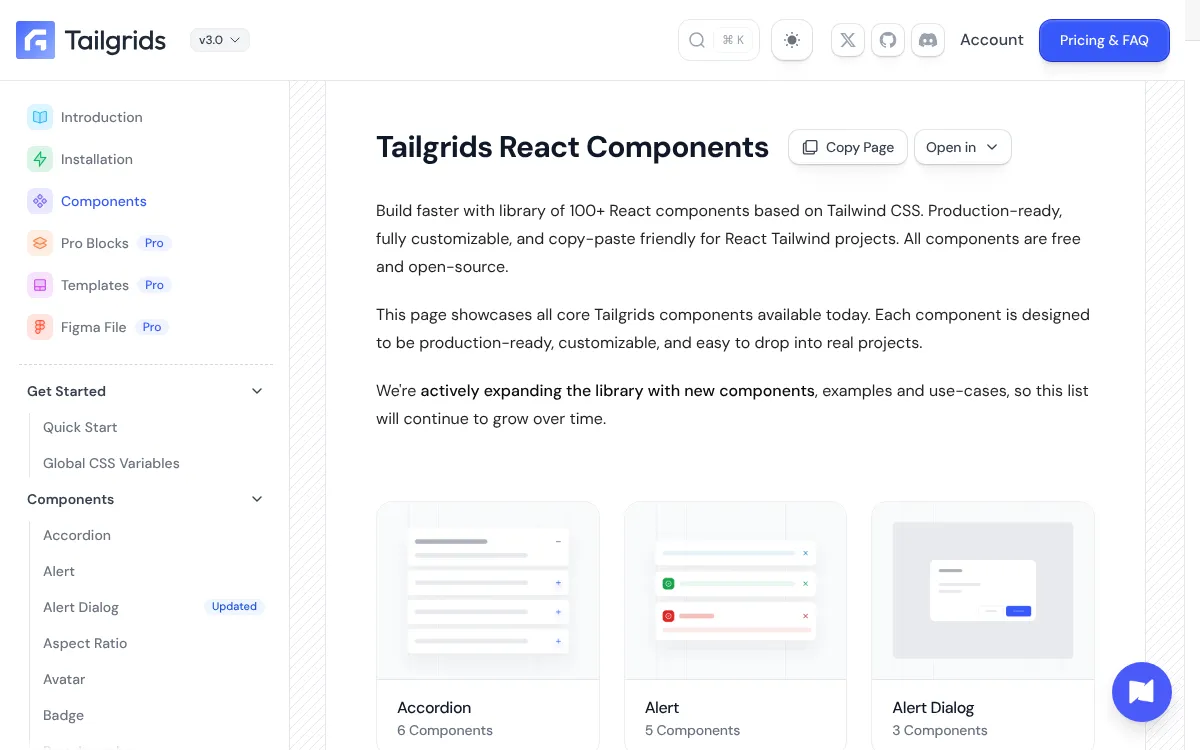
Tailgrids is an open-source React library with components, blocks, templates and a Figma design system, so designers and developers work from the same parts.
21st.dev
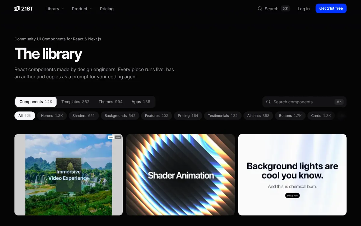
21st.dev lists more than 12,000 React components, templates and themes from design engineers, each with a live preview and a one-command install.
Beautiful UI
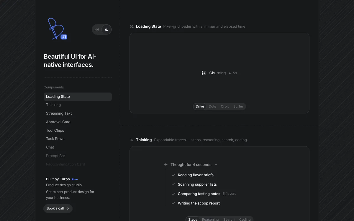
Beautiful UI is a small library for AI chat interfaces: thinking states, approval steps and answers that show their sources. It is a useful reference if your site is adding an assistant.
How to choose a React component library for a multilingual site
Five checks tell you whether a library will serve every market you sell in.
- Text length. Paste your longest German and French labels into buttons, tabs and menu items, and confirm each one stays whole.
- Reading direction. Switch the page to Arabic or Hebrew and confirm drawers, sliders and arrows mirror with the text.
- Keyboard and screen reader. Complete a form and close a dialog using the keyboard alone.
- Numbers, dates and currency. Confirm each one follows the visitor's locale.
- Ownership. Prefer components your team can edit, so a layout fix for one language takes minutes.
Our guide to user interface localization covers the same ground for the whole product, and localization testing tools lists what to use for the test pass itself.
Where to start
Start with the foundation: Radix UI if you have designers and a brand system of your own, shadcn/ui if you want a styled starting point you can edit. Add Sonner for confirmations and Vaul for mobile panels, then one animated section where it helps a product page. Run the five checks in every language before launch, and your interface will feel local in each market from the first visit.